Layered Navigation: Optimized vs. Unfit
Categorized as : Magento 2 Extensions
Complicated navigation is among the most often reasons why visitors leave online stores. According to Statista*, it stands just behind the price related drivers and total purchase refusals.
In order to reduce that frustrating number of exits online retailers make considerable efforts to optimize in-store search and product filter options. But the obtained value is not always clear and some stop on the halfway without going into finer details.
However, if you compare good and bad options, you will certainly feel the difference and below we provide you with the chance to see this on your own.
Conventional Filter Design
Customers are always in a hurry still no one knows the destination point. Anyway, browsing and purchasing are only welcomed in the case when it takes a few seconds to look around and get to shopping.
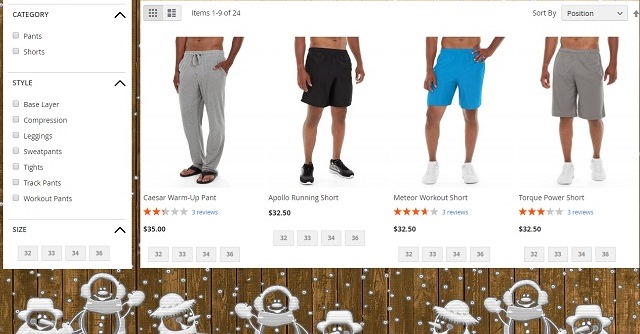
Most people do not like novelties and customers as well. So, you need to make your layered navigation interface simple and familiar allowing customers to select products just immediately. Try to avoid any specific colors, ornate backgrounds, exotic thumbnails and everything else that can distract from the final purpose to find and purchase products.
Just a Few Snowmen Make You Stop for a Second Before You Start the Navigation
Wrap Long Attribute Option Lists
In general, simplicity and effectiveness should be the motto of each digital store and simplicity is usually the best contributor to effective shopping.
The stores selling thousands of items usually generate dozens of options for each product attribute resulting in long filters going beyond one page screen. It makes people getting lost in navigation and takes some time and efforts to come back to the previous shopping trail.
Compact Lists are Definitely More Attractive and Applicable
Category Filters Go First
Each customer starts his attribute selection from the top of the page and it is naturally the best place for main filters. Of course, you can put first any filter you like, but the Category (or Subcategory) one looks most appropriate.
Depending on the category level, of course, customers are ready to narrow down the search area with a certain product type. For example, they know that they want a hoodie or jacket and the Category filter is the shortest way to the required product.
Colors Instead of Sportswear Types Look Really Confusing
Put Other Important Filters First
All other filter attributes should also maintain the required usability and business needs. Usually most important filters go first and here appears a great chance for effective on-site promotions. For example you can provide filters for products participating in sales or including free shipping. Customers will almost certainly choose ‘current sale’ products in their filters if you provide them with this great chance.
The Bag Seems to Be a Tempting Option
Add All Necessary Attributes
It’s obvious that different attributes have different values for merchants and customers. For example, wine bottle price primarily depends on the region of grape origin rather than its sort. So, including these attributes to filters also educates customers and states your expertise.
It is also wise to include some specific attributes to filters appealing to common sense. For example, you can describe your jackets like ‘Cool Autumn’ or ‘Windproof’. Considering such labels customers can quickly select the product range they need.
This is a Warm Jacket
Multiple Attribute Values Simultaneously
Sometimes customers do not know exactly what kind of a product they need. For example, they can hesitate between two colours or certain styles. In this case the opportunity to choose several attribute values simultaneously is absolutely indispensable. Otherwise, it becomes just annoying to select options one by one and compare them to each other loaded with a dozen of other attributes.
Checkboxes are a Good Implementation for the Purpose
Make Sure the Back Button Works
Alongside the provided layered navigation interface and functionality users still exploit their established browsing habits and usually appreciate the chance to rollback the latest filters in one click with the ‘back button’. This easy way allows them to come back to the previous filter state without too much thought.
Make Layered Navigation Available for Search Results
This option is especially useful for extensive catalogs, where searches return a significant number of products requiring additional filtering. Combination of these two functionalities is natural for effective product searches and allows customers to move from search to filtering just naturally.
Search Results Filtered by Layered Navigation
Conclusion
As a result, if we compare some ‘good’ and ‘bad’ actions you can take for your layered navigation filter, the difference may become just obvious.
Layered Navigation: Good vs. Bad
Magento is certainly good in layered navigation, but if you would like to take all the above ‘good’ steps, you will need a dedicated solution and the Layered Navigation extension is a great option in this case.
The extension is available for both Magento generations and allows you to create straightforward and effective filters leading to destination items and preventing store exits at the product search stage. Layered Navigation for Magento 1
 Layered Navigation for Magento 2
If you have any questions regarding the above extensions contact our support please.
References
*Reasons for Online Shopping Cart Abandonment

